What is technical analysis in trading?

The key factor that determines a trader's success is their ability to predict the price movement of an asset correctly. However, it's not about guessing – you can analyse the market and make informed decisions in trading, which ultimately increases your chances of potential profit.
There are 2 types of market analysis that you can apply to any financial market: technical and fundamental. Experienced traders usually combine both types of analysis and use a combination of various instruments to increase their chances of a correct prediction. In this blog post, we'll focus on technical analysis, and in the Fundamental analysis for beginners blog, we'll cover how fundamental analysis works.
What is technical analysis?
Technical analysis is purely based on analysing the past price movements. It is not affected by political and economic events in any way. Its ultimate goal is to identify patterns, predict future market behaviour, and determine the right time to buy (or sell) an asset.
Technical analysis can be performed in 2 ways: by identifying chart patterns or using technical indicators, both of which we'll go through in this blog post.
In both cases, you'd need to understand how to read a price chart, so let's go through that first.
What are the price charts in technical analysis?
A price chart is a graphical representation of a price movement of an asset over a selected period of time.
Every chart has a horizontal axis that represents time and a vertical one that represents the price. This screenshot, for example, shows the price fluctuations of the Volatility 10 index from August to November 2021.
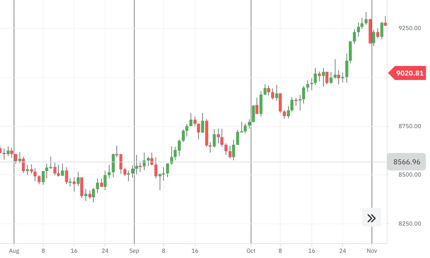
The price chart is essentially price movements in little units of time intervals. The time intervals can be set individually and typically depend on personal preference. Some traders prefer more detailed charts and set 1-tick or 5-minute intervals, while others prefer having a bigger picture and use hourly, daily or even weekly charts.
A tick chart, where 1 tick reflects 1 unit of price change, provides traders with the most detailed data, as it displays the price change every 1-2 seconds. This type of chart is mostly used in options trading and is available on DTrader and DBot.
Chart types
The 3 most commonly used chart types are:
- Candlestick chart
- Bar chart
- Line chart
Candlestick chart
One of the most popular charts among traders is a candlestick chart. Below is a screenshot showing how it looks.
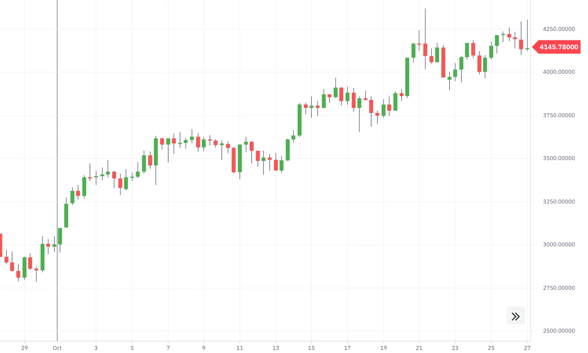
Each candlestick consists of a body and a wick that display the opening and closing prices of your selected time interval, as well as the highest and lowest prices reached within that time.
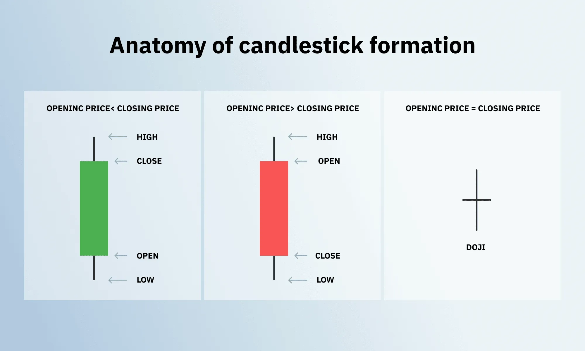
The body of the candlestick (the main square part) shows the opening and closing prices. If the body is red (black on some other platforms), it means that the closing price is lower than the opening price, with the opening price at the top of it. And if the body is green, the closing price is higher than the opening, with the opening price at the bottom.
The candlestick's wick (the lines at the top and/or bottom of the body) reflects the highest trading price reached within the set time interval at the top and the lowest at the bottom.
Let's say you choose to view your chart with 1-minute candlesticks. Each candlestick will reflect the asset's opening and closing prices (the body) of each minute, with the highest and lowest prices reached within the minute (the wick).
Bar chart
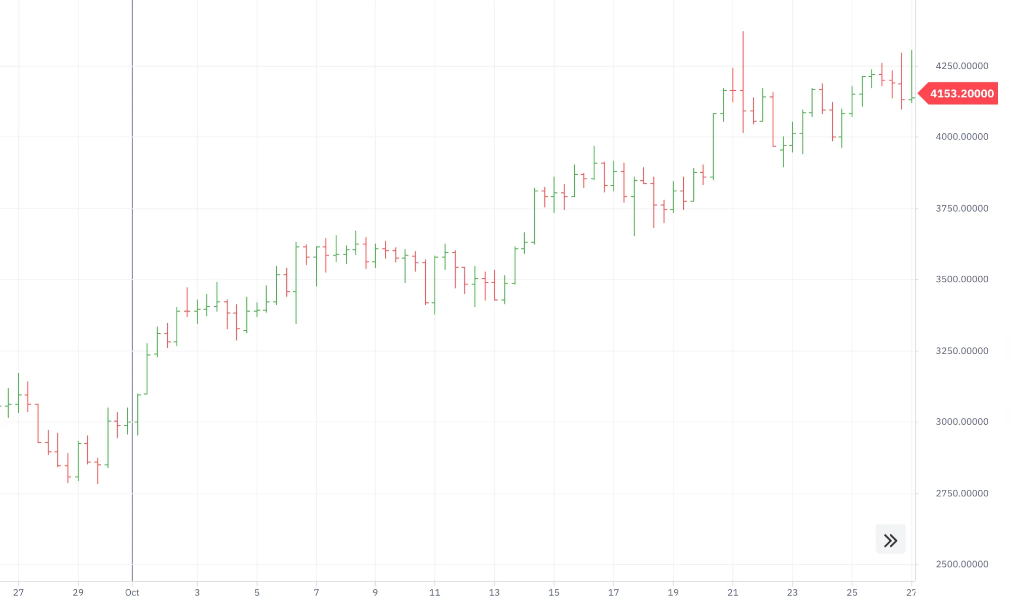
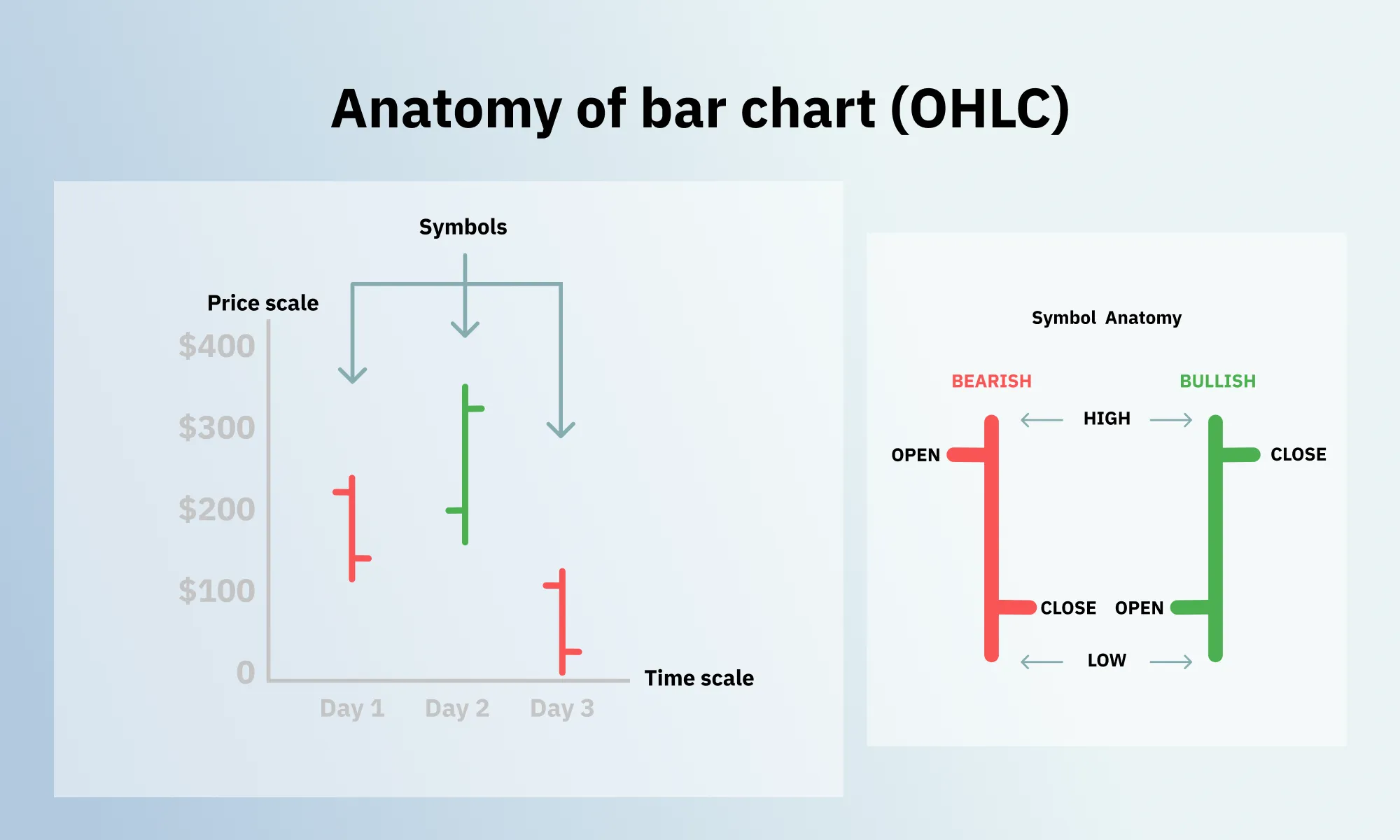
A bar chart, also referred to as OHLC chart, follows the same logic as a candlestick chart, but using bars instead of candlesticks. OHLC stands for the opening, the highest, the lowest, and the closing prices. Similar to candlesticks, the bars can be coloured (e.g. on DTrader) or just black (e.g. on Deriv MT5).
Line chart
A line chart displays only the closing price of an asset. While it provides less information, it also reduces the noise on the screen – which is great if you prefer your charts to look uncluttered. The line of the chart connects the closing prices of your selected time intervals (e.g. of every minute) which helps you clearly see movement trends. This type of chart is available on Deriv MT5.
A line chart can also be displayed as an area chart. In this case, the space between the horizontal axis and the line is filled with colour. This type of chart is available on DTrader.
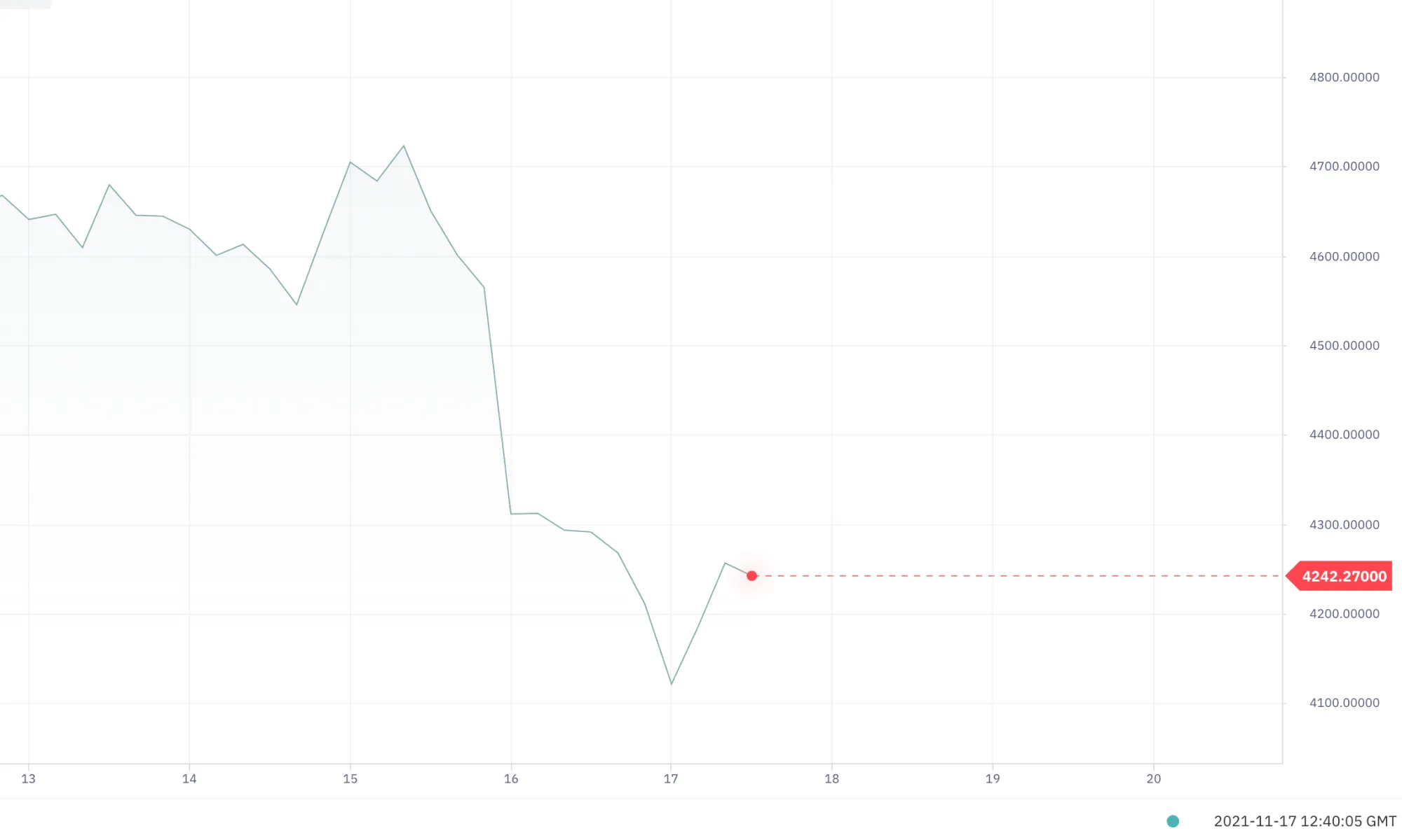
Some time intervals, like ticks, are too short to provide enough data to form a candle or a bar; hence, they can only be displayed with the line chart.
Chart patterns and technical indicators
Chart patterns and technical indicators are the 2 different ways of evaluating the price charts and market behaviour.
A chart pattern is a shape (e.g. a triangle) that you can draw over your price chart with the help of various drawing tools, just like you would draw a line, connecting the dots on a piece of paper. Identifying these shapes in a chart helps to suggest where the price is going to move next.
A technical indicator is a tool that helps suggest future price movements with the help of complex mathematical calculations. These indicators are also placed over your charts, and they calculate the potential price movements automatically, using historical data.
When doing technical analysis, you don’t have to choose one way over the other. In fact, you can use both chart patterns and technical indicators simultaneously to have more data to analyse. Let’s head to the ‘Support and resistance in chart patterns’ blog to find out how it works.
Disclaimer:
Volatility 10 Index, Options trading and DBot platform are not available for clients residing within the European Union and the United Kingdom.


